As someone working in product, I have found a super simple workshop exercise that I believe every product team should use to better visualise their metrics. In this article, I will break down why you should use this exercise and how to implement it successfully.
Why should you use it?
– Visibility: A metric tree exercise allows you to see all your key metrics in one place. It also allows you to know the hierarchy of your metrics and understand how they affect one another and what to work on.
– Stakeholder management: Do you ever find yourself trying to justify a seemingly insignificant metric when you know it is the key to everything? A metric tree can show stakeholders exactly how a certain metric influences the top line.
– Alignment: If you successfully build your tree as a team, you can settle debates and achieve alignment across the board.
What you will need
- Offline: A large board or wall, post-it notes (multiple colours), sticky dots, whiteboard pens and Sharpies – don’t get these two mixed up!
- Online: Miro or any other whiteboard app.
- 3-6 workshoppers. The more variety the better. You will ideally have the team member that drives the OKRs and a member of your data team. It is also important to choose a moderator.
- 3 hours. It will be worth every minute!
Step 1: Introduction (15 minutes)
⁃ Recap why you’re here. Make sure you do this in the invite, but it’s worth reminding everyone again by stating something such as:
“We want to better understand how our metrics support each other so we can…”
Or
“We want to find out which metrics are most important to target…”
Or, even,
“What the hell are the metrics we’re working on!? Let’s find out!”
⁃ Go over the itinerary. You should share the shape of the day, the activities you have planned and, importantly, when you can get some lunch! (Workshopping is hungry work).
Step 2: Break the ice (15 minutes)
⁃ Run an icebreaker to get everybody engaged.
⁃ Choose any activity from here. Don’t worry if they seem silly, ice breakers are meant to be fun.
Pro tip: Icebreakers help even if your workshoppers have known each other for years. You’ll always learn something new.
Step 3: Reframe the problem (5 minutes)
⁃ First, take the highest level metric your team is working on and reframe it as a user-based question.
⁃ Perhaps your product is a dating app and your metric is ‘Number of first dates booked’ (simplified to ‘First dates booked’). You should reframe this as: ‘What is helping/hindering the user to book a first date?’
⁃ It is important to include both sides. In this case, that means including both helping and hindering. This is something that will help you later on.
⁃ Write it the question in big letters at the top of the whiteboard.
Pro tip: Name your user, even if it is just ‘John’. This makes the scenario more real and gives your discussion a purpose.
Step 4: Choose your centrepiece (10 mins)
⁃ Add a fun, illustrated focal point at the centre of your board. The illustration should reflect the reframed problem from Step 3. See the above image used for the dating app example.
Alternatively, the illustrated centrepiece could be a stickman called John holding a heart-shaped balloon. The balloon represents his desire to go on a date. Always make sure your centrepiece reflects your central question. But also keep it simple and have fun with it.
⁃ Once you’ve decided, draw it in the centre of your whiteboard or download an image.
Pro tip: Remember, workshops are a way to trick your brain into thinking you’re not really working. Fun images or sketches are perfect for that.
Step 5: Answer your reframed problems (20 minutes)
At this stage, you should have a key question and a centrepiece illustrating the question. So, now it is time to answer the question. Start with the positive side – ‘helping’. Each workshopper then has 8 silent minutes to write their answers on post-it notes.
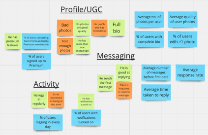
During this time, encourage your workshoppers to cast the net as wide as possible. In our example case, ‘What is helping John book a date?’, answers could be: "There are lots of people in his area” or "John has good quality photos!”. Remember, these don’t have to be true about your product right now, but if they were true, would they help the user?
After 8 minutes, get the team to spend 2 minutes sticking these to the right of the centrepiece. Don’t worry about rearranging the sticky notes based on similarity of theme yet.
Then repeat the 8 minute exercise for the negative side of the question: What is hindering the user?. Answers could be "He only has one photo!” or "He takes too long to reply to messages!”.
Once 8 minutes are up, spend 2 minutes sticking these answers on the left side of your centrepiece.
Pro tip: If offline, ask your workshoppers to write in CAPITALS on their post-it notes. This makes them much easier to read.
Step 6: Group your themes (10 minutes)
Great news! You now have a board covered in post-it notes. Now, as a team, order them into themes.
For many of your post-it notes, this will be very straightforward. Inevitably you will have ones which are corresponding negative/positive e.g. Positive "John is good at replying!” and negative "Takes lots of time to reply!”. You could group these under the theme ‘Messaging’. Also make sure to
remove duplicates, but make sure they are definitely duplicates and there aren’t subtle differences.
Pro tip: Group themes where it makes sense, but don’t force a post-it into a theme unless it truly belongs there. Orphan post-it notes are important too.
Step 7: Turn your answers into metrics (30 minutes)
This is where the magic happens. It is time to takeeach grouped theme and turn the post-it notes into metrics. This will be easier than you think as you’ve done the hard work already. Look at the example from above. We grouped ‘John is good at replying!’ and ‘Takes a long time to reply!’ into the theme ‘Messaging’.
These helps/hindrances can easily be turned into metrics e.g. ‘Average response rate’, and ‘Average time taken to reply’.
We know these metrics feed into the overall metric of ‘First dates booked’ because of the work done above.
Then, farm your grouped themes for metrics and dig out as many as you can. From ‘Messaging’, you could also add: "Average number of messages before first date booked’.
Pro tip: You’re not only looking for metrics you currently track. Think about what might also be helpful to track. Let the post-its guide you.
Step 8: Build your tree (40 minutes)
Now you have post-it notes grouped into themes and the metrics farmed from them. The next step is to remove the original post-it notes and the centre piece you lovingly illustrated earlier in the day. You’ll need space to start growing your tree.
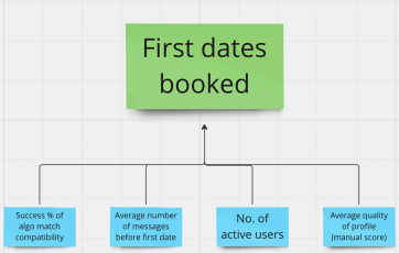
At the top, add a post-it with your overall business metric on it. In the example, this is ‘First dates booked’. Everything else feeds into this, so it should live at the top.
Next, add the branches. For this, you should choose the primary metrics from the ones you produced. A primary metric is one which cannot feed into any metric other than the overall business metric.
In our case study, , "Number of active users’ would be a primary metric since it feeds into no other metric bar the overall business metric.
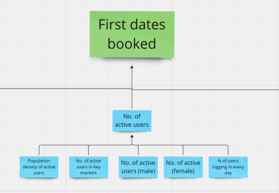
Once you have those branches, you can begin to add another layer. Add the metrics which feed into those branches, then the ones which feed into the ones you just added, and so on.
For example, ‘Percentage of users logging in every day’ feeds into the top branch metric ‘Number of active users’, which feeds into ‘First dates booked’.
Keep going until you have a well formed tree.
Step 9: Test your tree (15 minutes)
After building your tree, go back and revisit each branch. Make sure there are no superfluous metrics and if it feels like one is missing, add it! Then test each branch until you are happy.
Step 10: Mark your metrics (10 minutes)
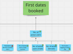
After testing your tree, ask a member of your data team to mark which metrics you track already and which ones you do not.
Mark the metrics you already track with green dots and a different colour for the new ones.
Now admire your tree! You should be able to see:
i) a clear metric hierarchy
ii) how they feed into each other
iii) how they link to the overall business metric.
Next steps
There are three final steps after you complete your tree.
1. Create a dashboard: With the help of your data team, produce a dashboard to track the current metrics.
2. Grow your tree: Tackle the list of metrics you don’t yet track. There is nearly always a way to track a metric, you just need to get creative.
3. USE YOUR TREE: Check in regularly. Make the tree part of your process. Don’t let your hard work go to waste!
So, next time you’re challenged on your OKRs, make sure to point to your metric tree. Show how that seemingly insignificant metric actually feeds into this important metric, which is absolutely vital for the all important top line business metric.
You’re welcome!


