
Product managers looking for academic materials on technology and user experience won't struggle to find what they need. However, when it comes to economics, especially Microeconomics, there are very few resources and case studies focused on the software industry.
Most of the examples you will find are about traditional sectors like mining, manufacturing, FMCG, etc., where 'labor force' is directly proportional to 'quantity manufactured’. But it does not apply to the software industry. Once you have a product, you can make infinite copies of it. Hence, traditional concepts of economics are not directly applicable to the software industry.
In this 2-part post, I will focus on bridging the traditional microeconomics concepts with the software industry to improve efficiency. You can read Economics of Software Part 2: Elasticity Explained straight after.
In these posts, I've tried my best to represent Microeconomics fundamentals in the software industry, and I hope it will certainly help you understand overall operations. Feel free to share your feedback at nihar@sawant.me. I am more than happy to hear your thoughts.
The first part is on the most famous Microeconomics topics Supply, Demand (and Market Equilibrium). Let's first understand the concepts before we apply them to the software industry.
Demand and supply explained
To understand demand and supply, let’s take the example of mobile phones. Here is a hypothetical data I have prepared for the mobile phone industry. At $1100, there is a demand for 100 phones, while at $250, there is a demand for 1000 phones. Similarly, at $200, suppliers will manufacture 100 phones, while at $1250, they will manufacture 1000 phones. Now, let’s understand what demand and supply are using this data.
| Quantity | 100 | 200 | 300 | 400 | 500 | 600 | 700 | 800 | 900 | 1000 |
| Demand | $1100 | $1000 | $880 | $750 | $620 | $500 | $400 | $320 | $250 | $200 |
| Supply | $200 | $250 | $320 | $400 | $500 | $620 | $750 | $900 | $1100 | $1250 |
The law of demand
Demand is the consumer's desire to purchase goods and services and willingness to pay for a specific good or service. In this example, the mobile phone is the most important electronic device we own at this age. From your children to grandparents and colleagues to customers, everyone is going to have a mobile phone. What does it tell us? There is a 'demand' for mobile phones as consumers like you, and I desire to purchase them.
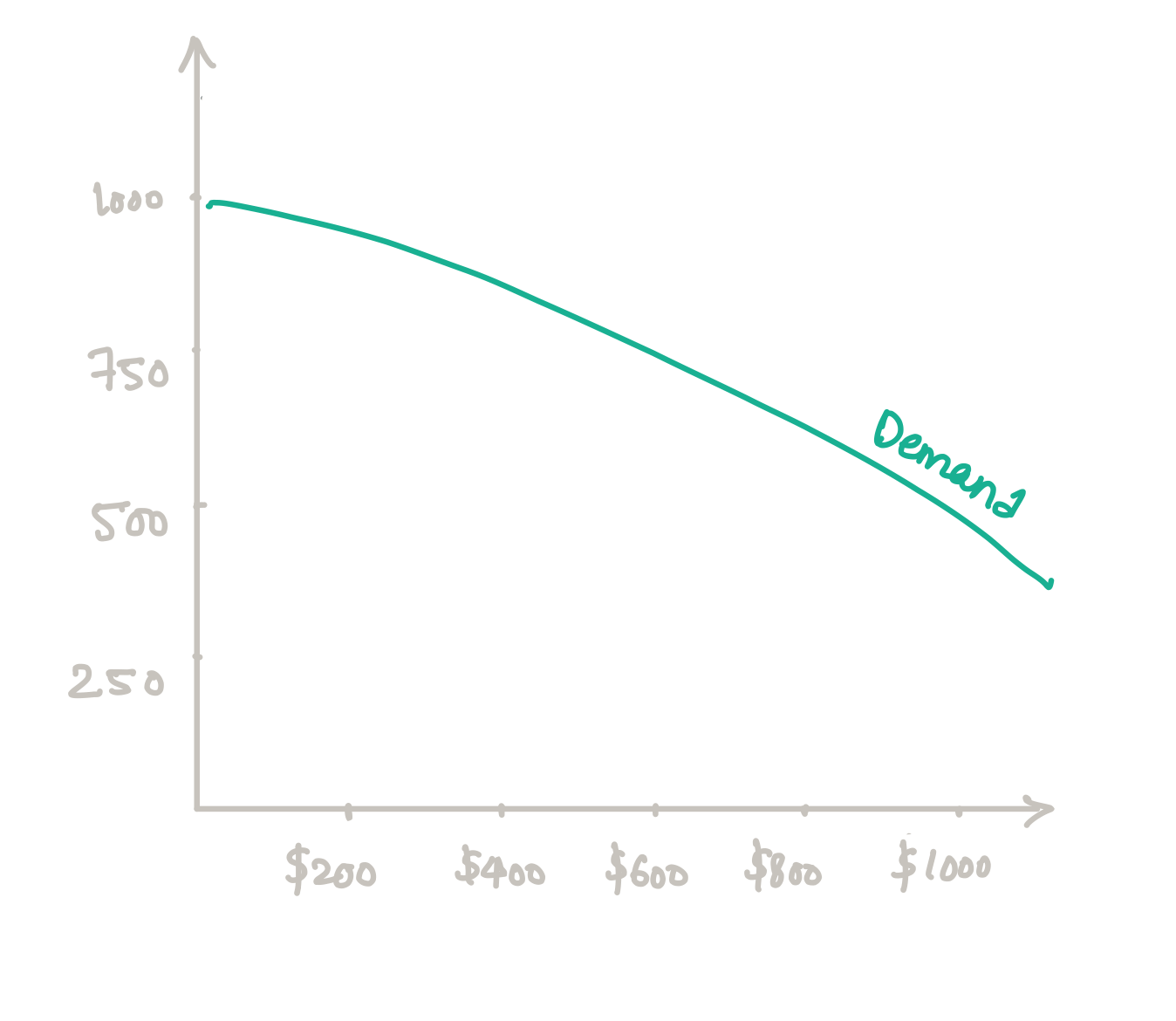
Based on the demand, we have one of the fundamental economics principles called The Law of Demand, which states:
Let's understand this using the mobile phone industry. We know that there is a demand for mobile phones, but many brands have different price ranges. For example, you have economical Android phones from Samsung, Huawei; then you have semi-premium phones from Xiaomi, OnePlus, you have premium phones from Apple. According to the law of demand, more consumers will go for economical Android phones than premium phones like Apple iPhone because the iPhone is more expensive than economical Android phones. It is true, especially for emerging markets.
So if we plot the diagram based on the data provided above, we will get a demand curve that will be downward-sloping that proves the law of demand.
Now there are some exceptions like Veblen Goods, where the quantity increases as the price increases. We will find luxury items in these categories, and we will talk about them in the end.
The law of supply
Supply is the total amount of a specific good or service available to consumers at a given price range. The Law of Supply states:
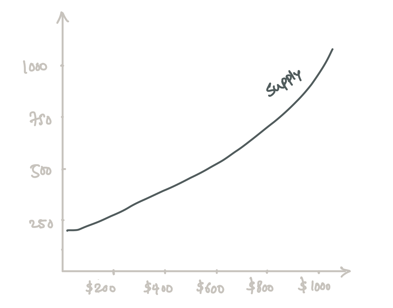
Let's apply this concept to the mobile phone market. Samsung is willing to manufacture only 10 phones at $100 because the margins are thin, they won't make more profits. In the case of $1000 phones, it is willing to produce 200 phones to increase the profits by buying raw materials in bulk, expanding the manufacturing plant’s capacity by investing more in the machinery, improving efficiency by producing more phones in bulk, etc.
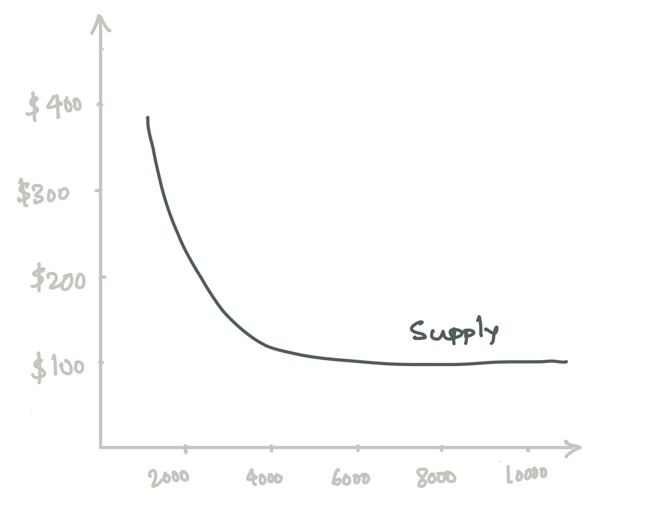
Similarly, if we hypothetically make supply-side data for all the manufacturers, it would look like the diagram on the top. As you can see, it is an upward sloping curve that justifies the law of supply.
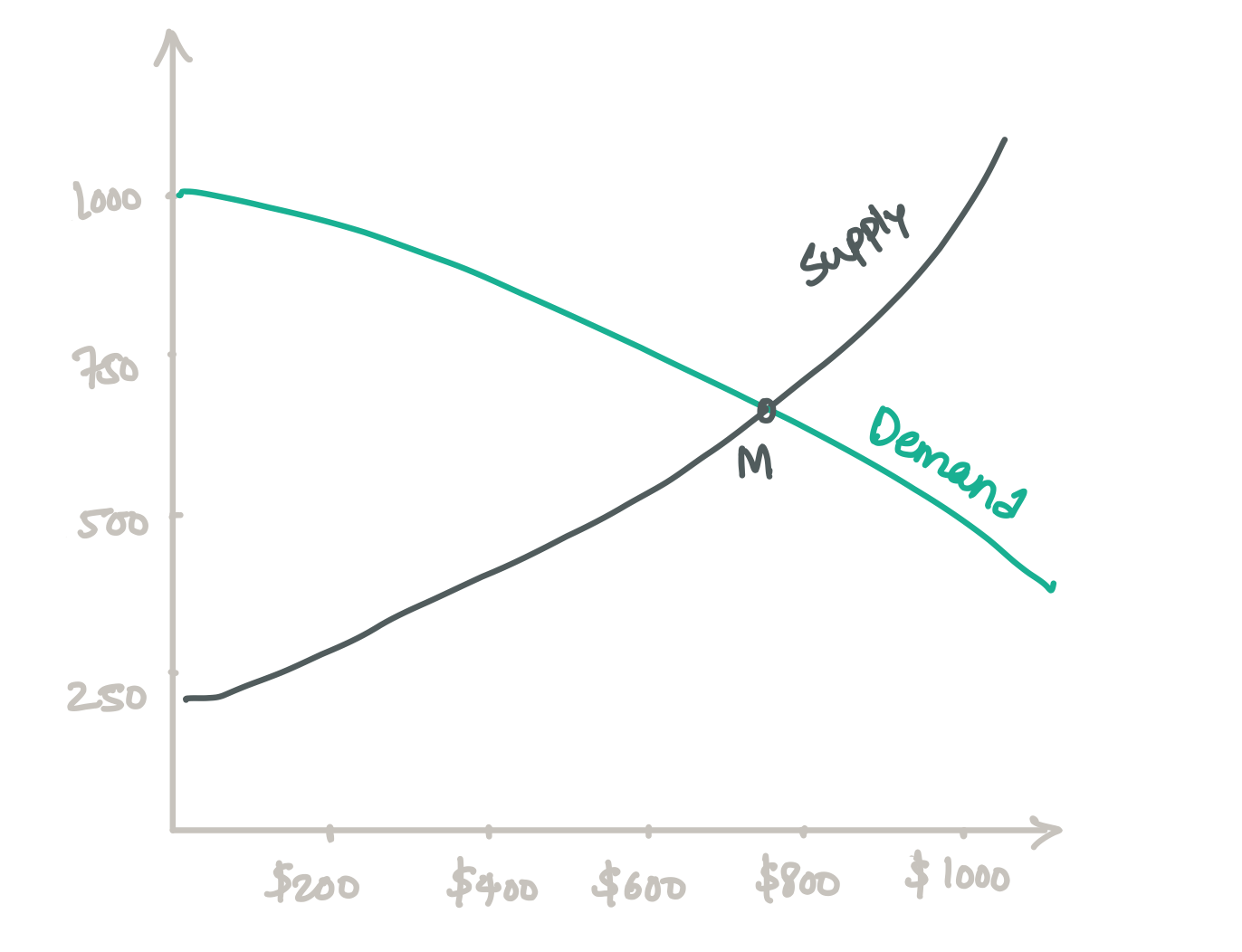
Market equilibrium
Now that we understand how demand and supply curves work, let's understand what is market equilibrium. Equilibrium is the state in which market supply and demand balance each other, and as a result, prices become stable. If we were to plot, the same supply and demand curve together, the market equilibrium would be at the M point. At point M, we are selling around 700 phones at $700. This is the state of market equilibrium where both supply and demand are equally satisfying the market. Read this article to discover more about product/market fit by Janna Bastow.
The law of supply does not work for software
Now that we know what demand and supply are let's try to implement them in software. If you have a software developed, it could be an operating system, database or mobile application; you don't have to make any kind of investment to increase the quantity. You can make infinite copies of software without much effort. Although, the software will not sell on its own. You need a sales and marketing team, but if you compare it to traditional manufacturing, this cost could be negligible. With the rise of marketplaces, some businesses invest little to none in sales and marketing. Let's try to understand how it applies to various software businesses.
I have divided the softwares into two parts:
- Offline software: Operating systems like Microsoft Windows, Ubuntu; databases like MongoDB, MySQL; creative tools like Sketch, Adobe Illustrator, etc.
- Cloud software / SaaS: Most cloud SaaS products across the domain like Salesforce, Mailchimp, Intercom, etc.
Offline software
Till the early 2000s, offline software dominated the software industry. Many softwares fall in this category:
- Database: MySQL, MongoDB, Microsoft SQL Server
- Games: Braid, Monument Valley, Assassin's Creed, etc. (In other words, a game that does not rely on a network)
- Productivity Tools: Microsoft Office, Email Clients, To-do apps, etc.
- Operating Systems: Microsoft Windows, Ubuntu. etc.
- Creative Tools: Sketch, Final Cut Pro, Adobe Photoshop, etc.
The advantage of such tools is: there is a high production cost of development, but once you have developed the software, you can make infinite copies of it.
For example, assume it is early 2010, and you are trying to build an Adobe Illustrator competitor focused on UI/UX design called 'Sketch Mate.’ I have created a rough table with hypothetical data, which you can refer to below:
| Employees | Total Cost | Quantity | Cost Per User | Demand | Supply | Revenue | Profit |
| 5 | $375,000.00 | 1000 | $375.00 | $500.00 | $375.00 | $375,000.00 | $0.00 |
| 5 | $375,000.00 | 2000 | $187.50 | $380.00 | $187.50 | $375,000.00 | $0.00 |
| 5 | $375,000.00 | 3000 | $125.00 | $250.00 | $125.00 | $375,000.00 | $0.00 |
| 5 | $375,000.00 | 4000 | $93.75 | $175.00 | $99.00 | $396,000.00 | $21,000.00 |
| 5 | $375,000.00 | 5000 | $75.00 | $130.00 | $99.00 | $495,000.00 | $120,000.00 |
| 5 | $375,000.00 | 6000 | $62.50 | $99.00 | $99.00 | $594,000.00 | $219,000.00 |
| 5 | $375,000.00 | 7000 | $53.57 | $75.00 | $99.00 | $693,000.00 | $318,000.00 |
| 5 | $375,000.00 | 8000 | $46.88 | $50.00 | $99.00 | $792,000.00 | $417,000.00 |
| 5 | $375,000.00 | 9000 | $41.67 | $35.00 | $99.00 | $891,000.00 | $516,000.00 |
| 5 | $375,000.00 | 10000 | $37.50 | $15.00 | $99.00 | $990,000.00 | $615,000.00 |
Let's assume you have a team size of 5, with most of them being developers, and the average cost per team member is $75,000, including all the benefits. Hence, their total cost is $375,000 per year. Keeping that in mind for the first 1000, 2000, 3000 users you could charge $375, $187.5, $125 to be break-even. After that, you could simply settle the price at $99 and start making profits. And keep selling the software. Hence, your supply curve would look like a downward sloping straight-line, unlike the traditional supply curve adhering to the law of supply.
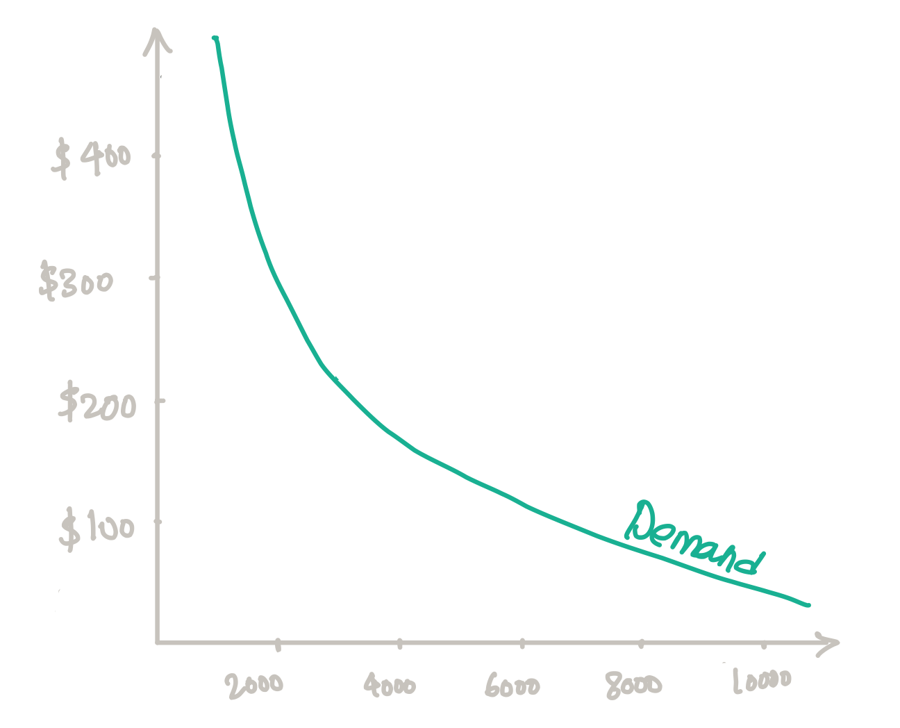
Now, let's try to plot a demand curve. The best way to collect the data for the demand curve is by survey and market research. You can survey designers and understand how much they are willing to pay for the software license. Alternatively, you can do market research. Public companies like Adobe often release their product usage, which could act as a benchmark for you. For this example, I have added a dummy demand data in the above table:
If you plot both demand and supply lines, you will find that the market equilibrium is at $99 where you could sell around 6000 licenses. After that, no one will go for your product. It could give you a decent profit as well. If you want to sell more, then you have to reduce their prices by bringing more efficiency. In this case, you could simply stop the development and only focus on selling at a low cost, but customers won’t renew the license as there are no updates. Hence, to sustain profitability, you have to keep improving the product. Now let's look at the Supply and Demand curve.
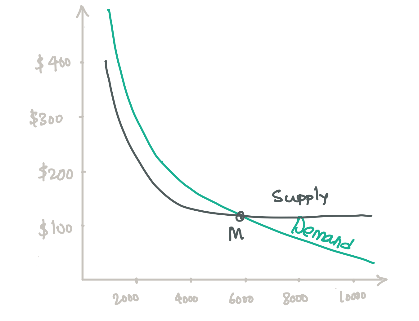
As you can see, the supply curve is not the traditional supply curve with an upward slope. You can also see the market equilibrium at M. Because you can make infinite copies, your curve more or less remains straight-line after a while.
Although this is an ideal case scenario, you managed to scale to 3000 users on your own, you can't go beyond that, and you decided to invest in Sales. For the sake of simplicity, let's say one salesperson can close 1000 licenses in a year. Hence, to keep closing 1000 deals, you have to hire more and more sales team members. Let's see how our revised supply curve will look like:
| Employees | Total Cost | Quantity | Cost Per User | Demand | Supply | Revenue | Profit |
| 5 | $375,000.00 | 1000 | $375.00 | $500.00 | $376.00 | $376,000.00 | $1,000.00 |
| 5 | $375,000.00 | 2000 | $187.50 | $380.00 | $188.00 | $376,000.00 | $1,000.00 |
| 5 | $375,000.00 | 3000 | $125.00 | $250.00 | $125.50 | $376,500.00 | $1,500.00 |
| 6 | $450,000.00 | 4000 | $112.50 | $175.00 | $125.00 | $500,000.00 | $50,000.00 |
| 7 | $525,000.00 | 5000 | $105.00 | $130.00 | $125.00 | $625,000.00 | $100,000.00 |
| 8 | $600,000.00 | 6000 | $100.00 | $99.00 | $125.00 | $750,000.00 | $150,000.00 |
| 9 | $675,000.00 | 7000 | $96.43 | $75.00 | $125.00 | $875,000.00 | $200,000.00 |
| 10 | $750,000.00 | 8000 | $93.75 | $50.00 | $125.00 | $1,000,000.00 | $250,000.00 |
| 11 | $825,000.00 | 9000 | $91.67 | $35.00 | $125.00 | $1,125,000.00 | $300,000.00 |
| 12 | $900,000.00 | 10000 | $90.00 | $15.00 | $125.00 | $1,250,000.00 | $350,000.00 |
Even after adding the sales team’s cost, you still do not see any significant change in the supply curve (S1). However, we have made a slight change. The price of the software can not be $99 because that will not keep the company profitable. Hence, you have decided to keep the price at $125. In this way, you will be able to make profits, but you will sell between 5000-6000 licenses.
That’s how a supply and demand curve looks like for offline software. Because we increased the price, market equilibrium for the new supply curve has also changed.
Cloud software / SaaS
Even in the case of cloud software, the supply curve will remain the same. The only additional cost is going to be server costs. So let's do that. Let's say you are trying to move 'Sketch Mate' from an offline tool to an online tool just like Figma. Now, there are plenty of advantages to this model, primarily from increased customer engagement and adoption. In traditional offline software, users keep all the items in their drive to always be hesitant to pay monthly or go for a subscription. But with the cloud, there is no way for users to access it offline. You have to keep paying them monthly to access their 'cloud.’ We will discover more about it in Part II. But let's stick to the supply and demand curve.
| Cost / Employee | Infra Cost | Total Cost | Quantity | Cost Per User | Demand | Supply | Revenue | Profit |
| $75,000.00 | $1,000.00 | $376,000.00 | 1000 | $376.00 | $500.00 | $376.00 | $376,000.00 | $0.00 |
| $75,000.00 | $1,000.00 | $376,000.00 | 2000 | $188.00 | $380.00 | $188.00 | $376,000.00 | $0.00 |
| $75,000.00 | $1,500.00 | $376,500.00 | 3000 | $125.50 | $250.00 | $125.50 | $376,500.00 | $0.00 |
| $75,000.00 | $1,500.00 | $451,500.00 | 4000 | $112.88 | $175.00 | $125.00 | $500,000.00 | $48,500.00 |
| $75,000.00 | $2,400.00 | $527,400.00 | 5000 | $105.48 | $130.00 | $125.00 | $625,000.00 | $97,600.00 |
| $75,000.00 | $2,400.00 | $602,400.00 | 6000 | $100.40 | $99.00 | $125.00 | $750,000.00 | $147,600.00 |
| $75,000.00 | $2,400.00 | $677,400.00 | 7000 | $96.77 | $75.00 | $125.00 | $875,000.00 | $197,600.00 |
| $75,000.00 | $2,400.00 | $752,400.00 | 8000 | $94.05 | $50.00 | $125.00 | $1,000,000.00 | $247,600.00 |
| $75,000.00 | $3,000.00 | $828,000.00 | 9000 | $92.00 | $35.00 | $125.00 | $1,125,000.00 | $297,000.00 |
| $75,000.00 | $3,000.00 | $903,000.00 | 10000 | $90.30 | $15.00 | $125.00 | $1,250,000.00 | $347,000.00 |
Ideally, cloud software demand should be higher because there are many benefits like cross-platform, portability, etc. But for now, let's say that the demand for 'annual subscription is the same as earlier. Our supply curve based on the above data would look like this:
Again, no major change in the curve. Discover insights on a product manager’s approach to building integrations for SaaS software.
How does this help you as a product manager?
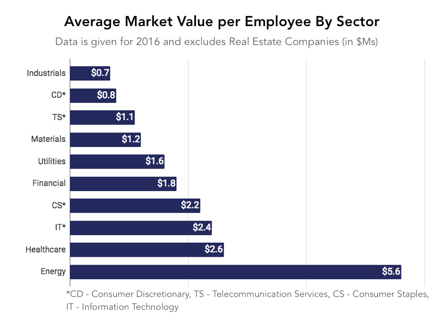
The revised supply curve of the software indicates that the software industry is a highly lucrative business. After energy (which is driven by the increasing cost of crude oil), healthcare and IT are the two sectors with the highest revenue per employee.
If your team is highly efficient, you could build a product with extremely high margins. And the reason: you could make infinite copies of your product.
Focus on the efficiency
A relatively flatten supply curve is an indication that if you could achieve operational efficiency. Although you may not be a direct influence when it comes to hiring designers and engineers, plotting market equilibrium curves could help you understand how efficient you are as a team.
Explore more insights on Software. For even more content on a range of product management topics, see our Content A-Z.