
In this guest post, Product Manager Vignaraj Gadvi delves into what Hick's Law is, why it matters in the world of UX/UI design, and how to implement it effectively.
If you're a product manager or a designer, you've probably heard the phrase "Keep it simple and straightforward." But do you know where this advice comes from? Or why is it so important to design? The answer is Hick's Law, which can help guide your decisions on design.
What is Hick's Law?
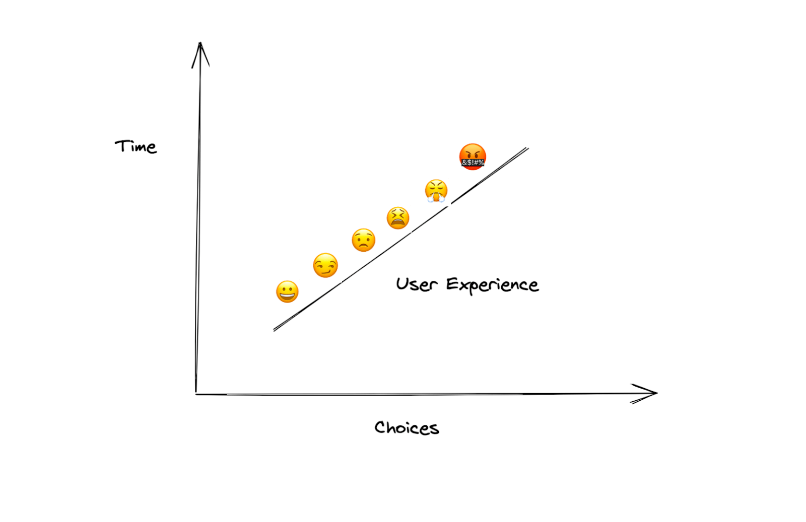
Hick's Law states that the time it takes to make a decision increases with the number of options. In other words, if you have 10 things to choose from and pick one, you can move on quickly. But if there are 1 million things to choose from, selecting any one of them is going to take a lot longer.
The law was first proposed by psychologist William Edmund Hick (1898-1961) in his 1952 book “On the rate of gain of information”.
Why is Hick's Law important to design?
Hick's Law is a psychological principle that describes the time it takes to make a decision as the number of options increases. This is important to design because it means that you can use Hick's Law to guide any decision where there are many possible choices. For instance, if you're making a website and want to know which navigation menu option is best for your users, you can use Hick's Law to determine the best choice based on how fast and easy it will be for your users to find what they need in your site.
Real-world examples of Hick’s Law in action
Here are some real-world examples of Hick's Law in action.
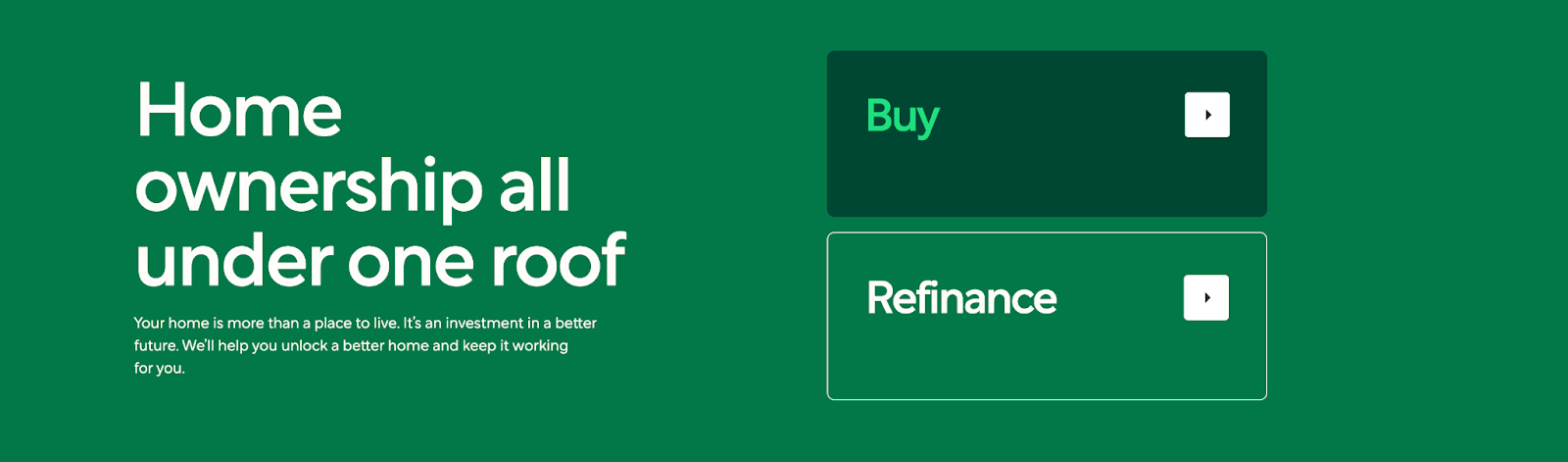
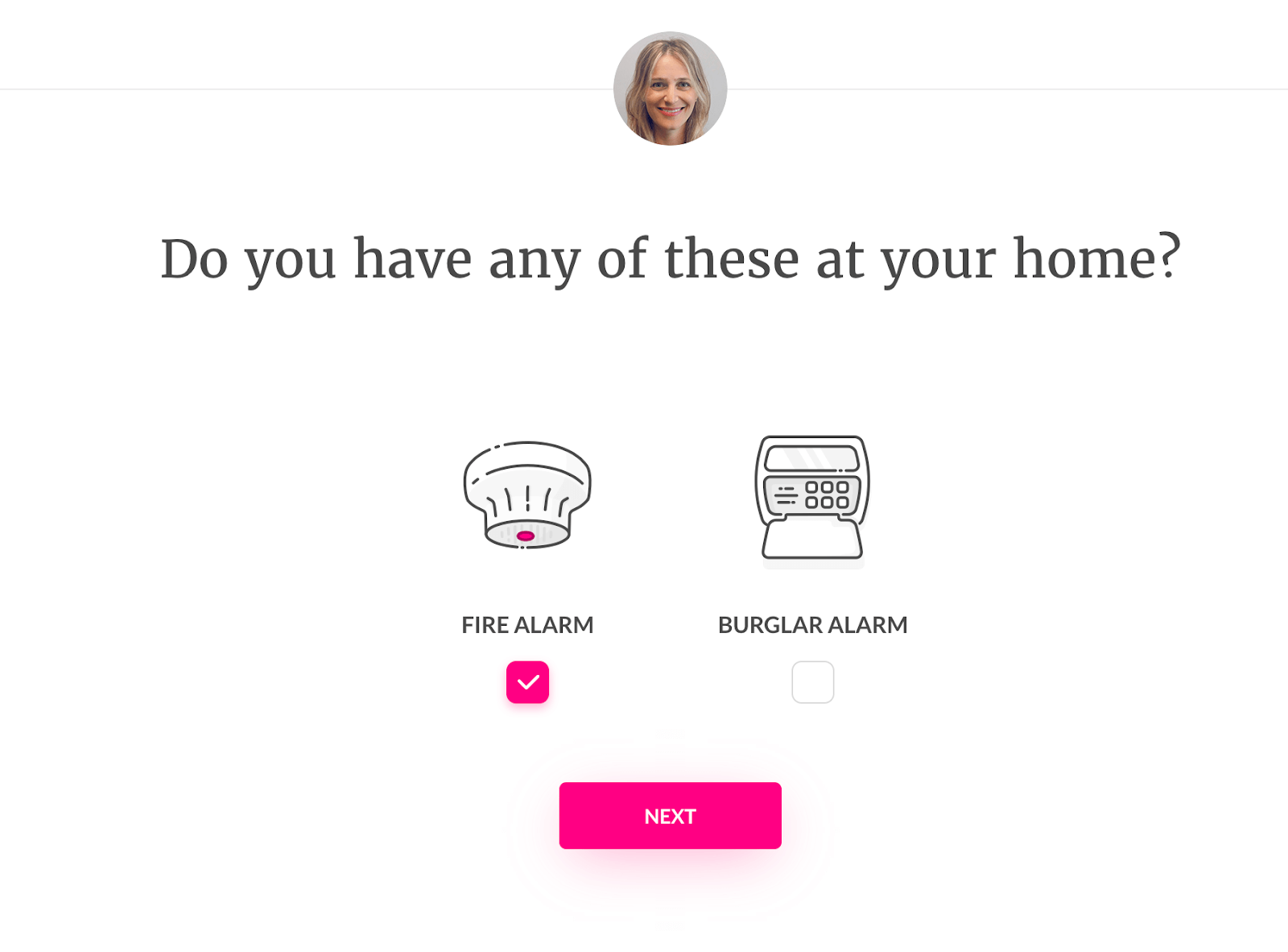
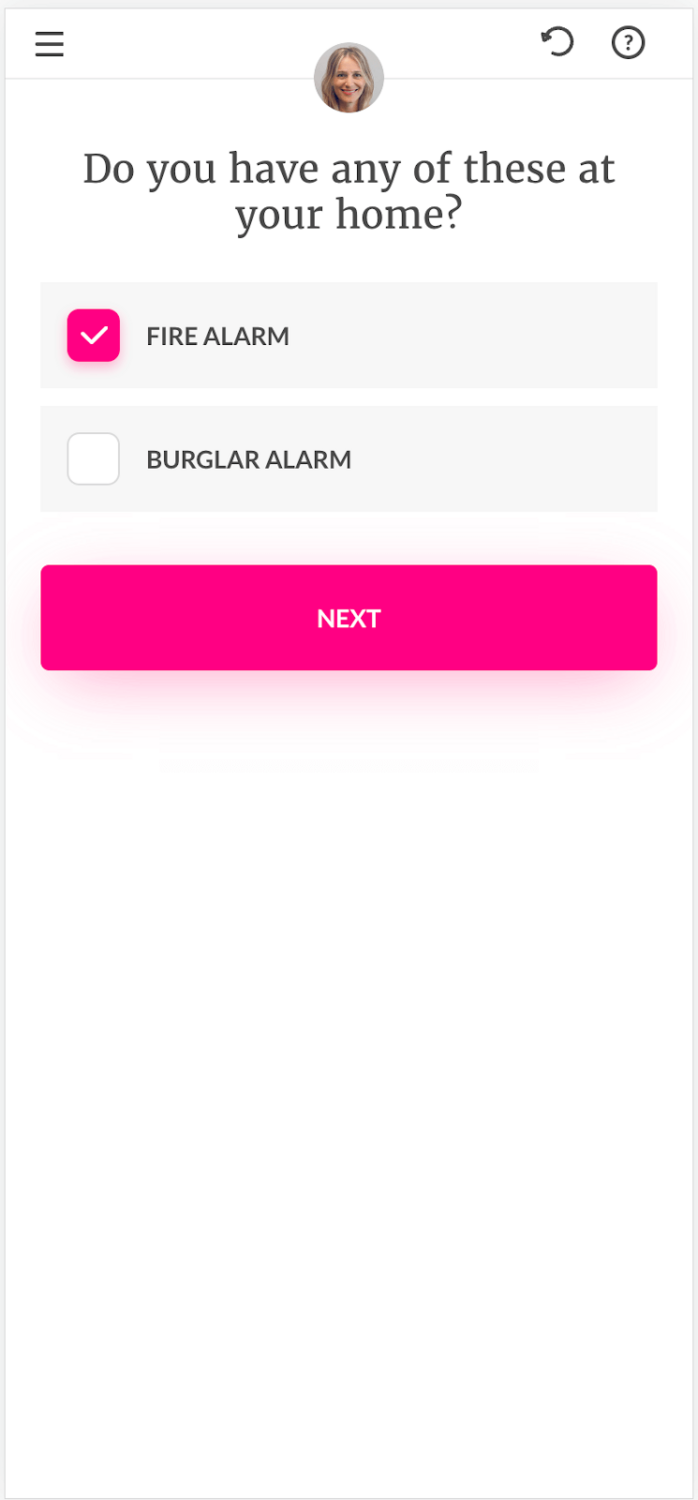
- Highlight options for faster decision-making – Make sure that people can quickly find the option they want by highlighting it in some way (such as bolding or italicizing). This can be done with icons, colors or text labels. Your landing page is the first impression your user will have of your site. What do you want your user to do?
Take for instance Better’s homepage. Clutter-free, it is also action-driven. With two goals per customer when they land on this page, buy a home or refinance their mortgage – the options are highlighted by contrasting colors making one of them stand out as being more important than the other in light of recent market conditions;
- Break down complex steps into smaller steps: If something is too complicated for users to understand on the first pass, break it down into simpler chunks so they don't get confused or lost while using your product/website/app etc.. Also make sure that each step has a descriptive title so users know what they're doing at every step of the process.
For example, Lemonade, the AI-based insurance company offers a minimalist yet thorough onboarding process. They do this by breaking down their customer's needs one step at a time and using psychology in order to focus them on continuing through the process without being distracted too much along the way. I really like how they offer an engaging mobile experience while also making it easy to understand desktop with icons rather than words.
Desktop Mobile
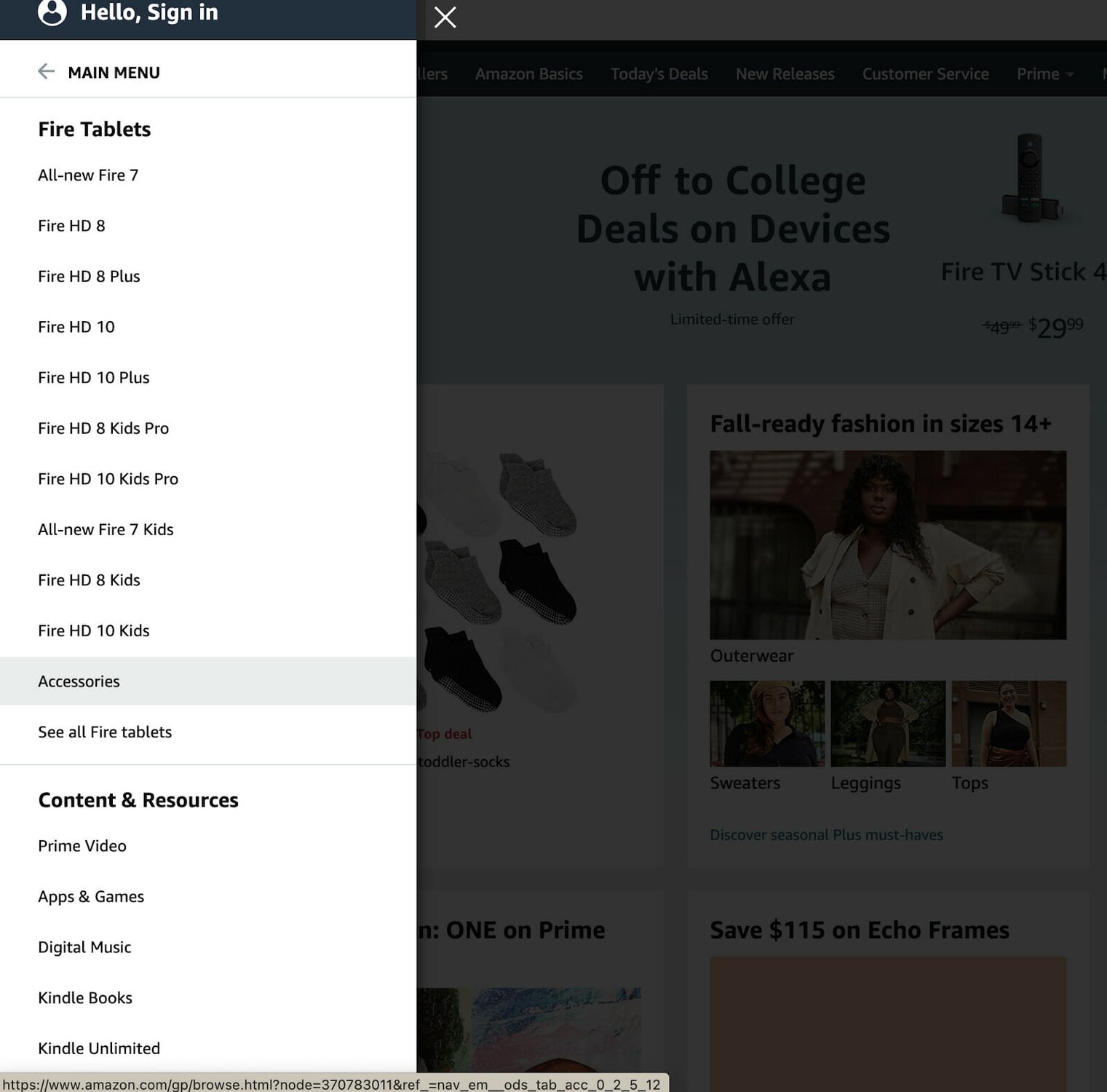
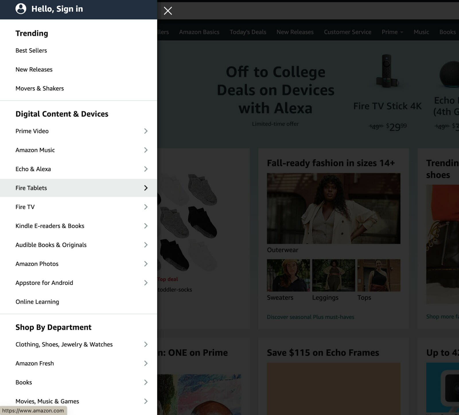
- Categorize options to make them easier to find: create categories in which similar tasks are grouped together (e.g., "Travel", "Food & Drink", "Shopping") then use consistent icons/labels within each category so users have an idea about what type of experience they're about to have when visiting those pages within these distinct sections (for example: if all pages under “Shopping” contain similar items like clothing items then use an icon such as a shopping bag next time you want someone looking at these types.)
One of the best ways to find something quickly is by searching via Amazon's search bar; you just type in a product name and find results instantly. But if you're not sure what you want, that's pointless – you'll end up overwhelmed with all the options. In these situations, they break the pattern by categorizing options so that it's easier to navigate.
Additionally, companies like amazon make things even simpler for customers- They offer guided purchasing solutions such as Amazon Prime Wardrobe (which allows customers to try new clothes at home before committing) or Prime Now (which offers same-day delivery). These services remove any hassle from ordering products online or having them shipped directly to their doorstep within hours of placing an order.
To summarize
Here’s how you can use Hick’s law to help guide your design decisions.
- Hick's Law is a cognitive principle that states that the time it takes the user to make a decision increases with the number of options.
- In other words, don't overwhelm your users with too many choices or options because they will take longer to make a decision and may even leave without making one at all.
- You can apply this concept in many areas of design such as navigation menus, home pages and other elements of a website.
Hick's Law is a theory that states the time it takes for a person to make a decision increases with the number of options. For example, if you have three choices on your website – green (1), blue (2) and red (3) – then it will take one second for someone to choose one option.
Remember, It shouldn’t be the only factor in your decision, but it should definitely be considered when designing interfaces and websites. I think the biggest takeaway from this whole thing is that people don't like things that are complicated or confusing. Keep your designs simple, clear, and easy to understand.