
Over the coming days, weeks, and months you'll notice that our brand has received a bit of a makeover. In this post, we'll reveal how we've chosen to elevate our beloved venn, brand colours, and more.
Mind the Product started as ProductTank in 2010 – a simple meetup with just 25 people in the back room of a London pub – and an even simpler logo.
While we quickly moved on from that oh-so-2010 reflected ProductTank logo, over the last decade we have grown into so much more than that simple meetup too. Today we include multiple global conferences, an incredible training program, and awesome product content – all underpinned by our amazing community in over 200 chapters around the world.
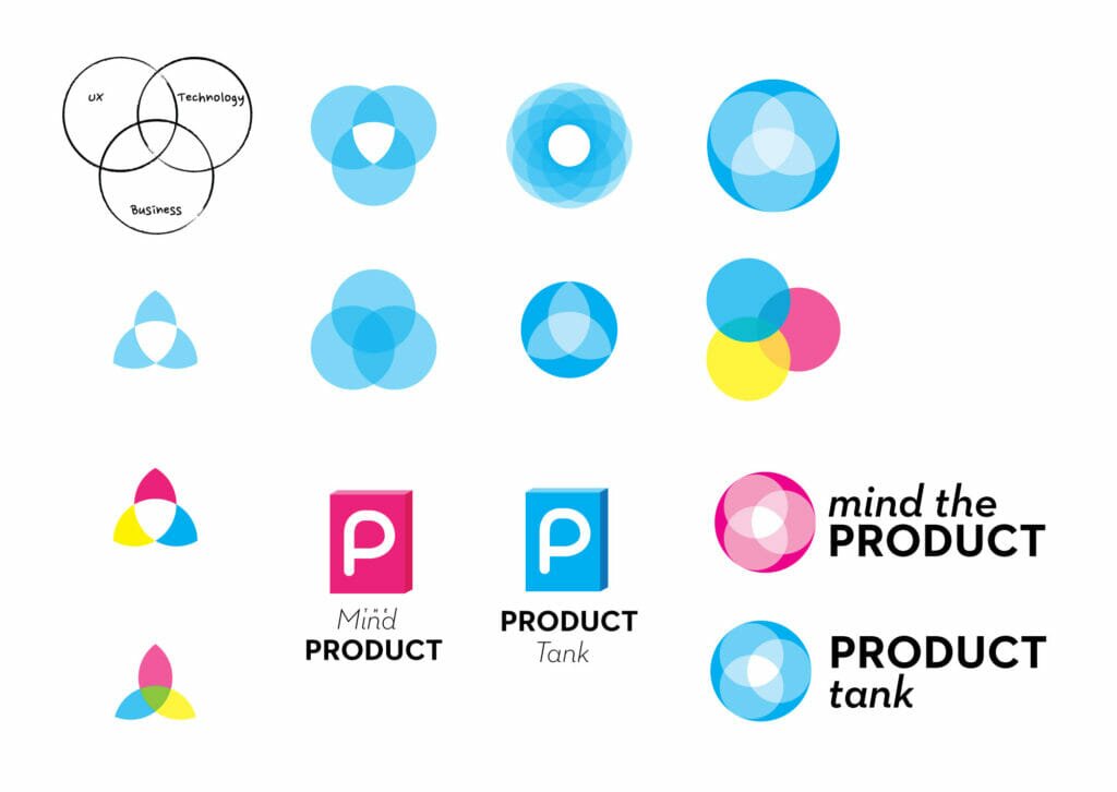
Originally designed by Martin, the Mind the Product and ProductTank brand had three really strong elements;
- Our signature cyan colour
- The typography linking the two brands (created by Andreas Carlsson)
- Our venn logomark
These three elements worked well as we grew Mind the Product to the world's largest product community.
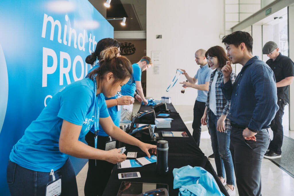
At our conferences in London, San Francisco, Singapore, Manchester and Hamburg, we used our cyan to let our attendees know they had arrived at the home of product, with cyan banners, t-shirts, coffee cups, cocktails and in some cases, hair.
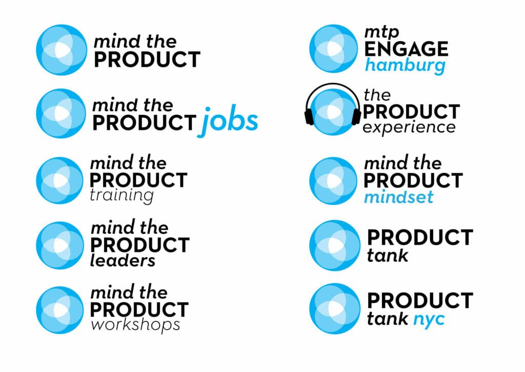
In addition to our live events, we have grown to include training, a job board, a thriving blog, and a membership platform. And we kept creating new versions of the logo to accommodate.
But with all this growth we found ourselves needing a visual identity that could flex to accommodate everything we do in a more consistent way. We found that there’s only so many times you can paint something cyan and stick a venn on it, and the more things we needed to put our logo on, the less practical our original approach became. So an update to the brand had long been on the cards, and our 10th anniversary felt like the perfect time to launch a new look and feel for Mind the Product.
Coming in to 2020 our brand team was busy putting the finishing touches to a new brand identity that we’d been working on for months, and getting ready for a big reveal at our San Francisco conference.
We all know what happened next…
Fast forward twelve worrying months, and we’re relieved to say that we’re still here, our digital conferences have been a great success, our pivot to a membership model even more so, and we can now start looking to the future again. We might not be launching our new brand with the glitz and glamour (and cyan hair) of our San Francisco conference, but we are launching it proudly and with thanks to our amazing community.
Our new logo
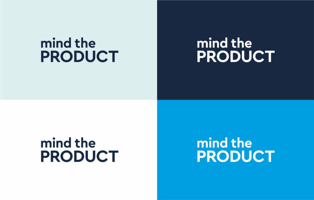
We chose to remove the venn from the logo in favour of a simpler logotype using a contemporary geometric typeface. The circular forms in the typeface mirror the circles used throughout the brand and have a feeling of warmth that reflects our brand personality.
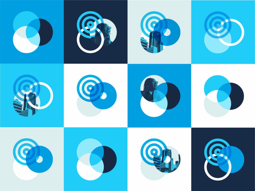
The venn
The venn is such an important part of our brand but by removing it from the logo we’ve freed it up to become a more flexible graphic device. We’ve explored new interpretations of the venn to allow us the freedom to inject more movement, life, and creativity into our designs.
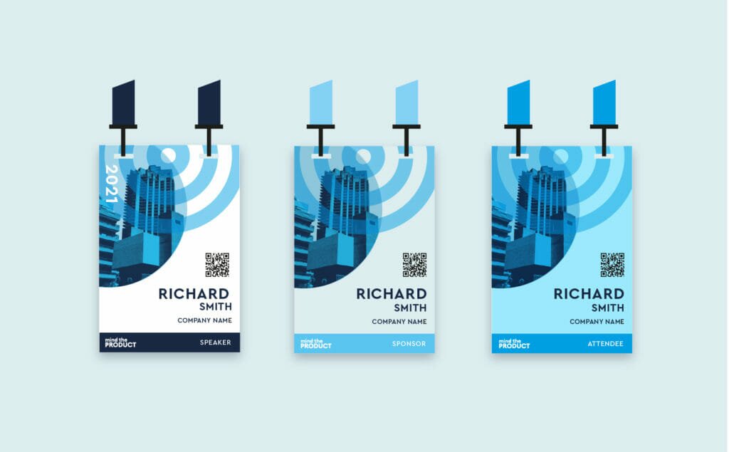
New colours
Cyan is always going to be our thing, it’s a big part of our identity. But over the years we’ve found ourselves needing more colours to help create variety and differentiation in our visual identity. This led to inconsistencies creeping in.
Rather than introduce supporting colours that could dilute our brand, we’ve chosen to double down on the cyan, introducing a palette of shades of cyan.
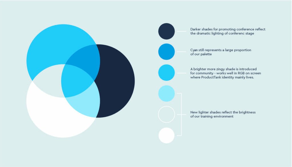
We wanted to find a way to give each of the sections of our business (training, conferences, blog etc) identities of their own, that had subtle differences whilst still feeling part of the same brand. We wanted the colours we use when talking about our conferences to reflect the dramatic lighting of the conference hall, and the colours we use when talking about our training to reflect the brightness of our training environments.
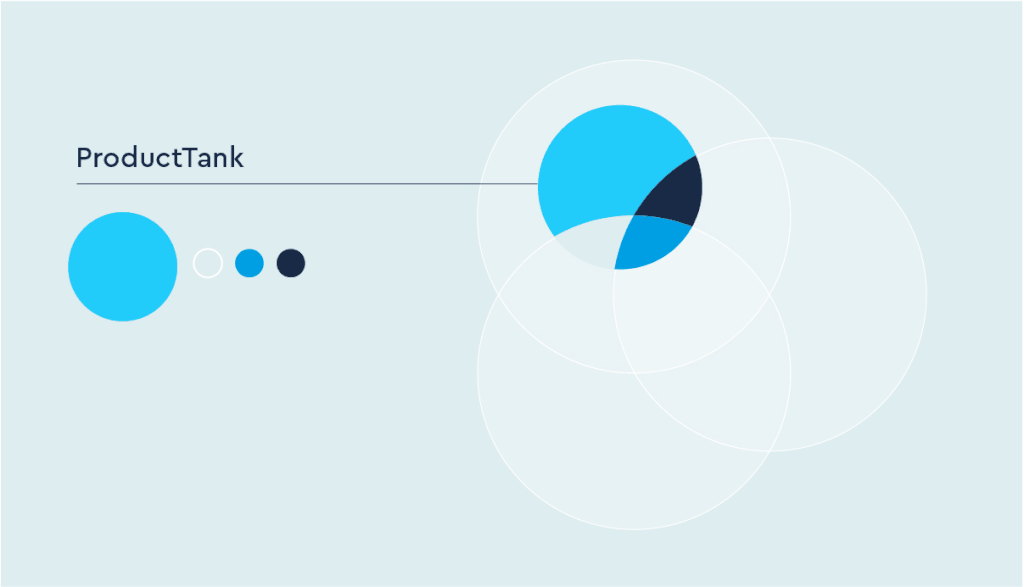
We came up with a fun system to help us define what these colours should be, that also reflects the three pillars of our business.
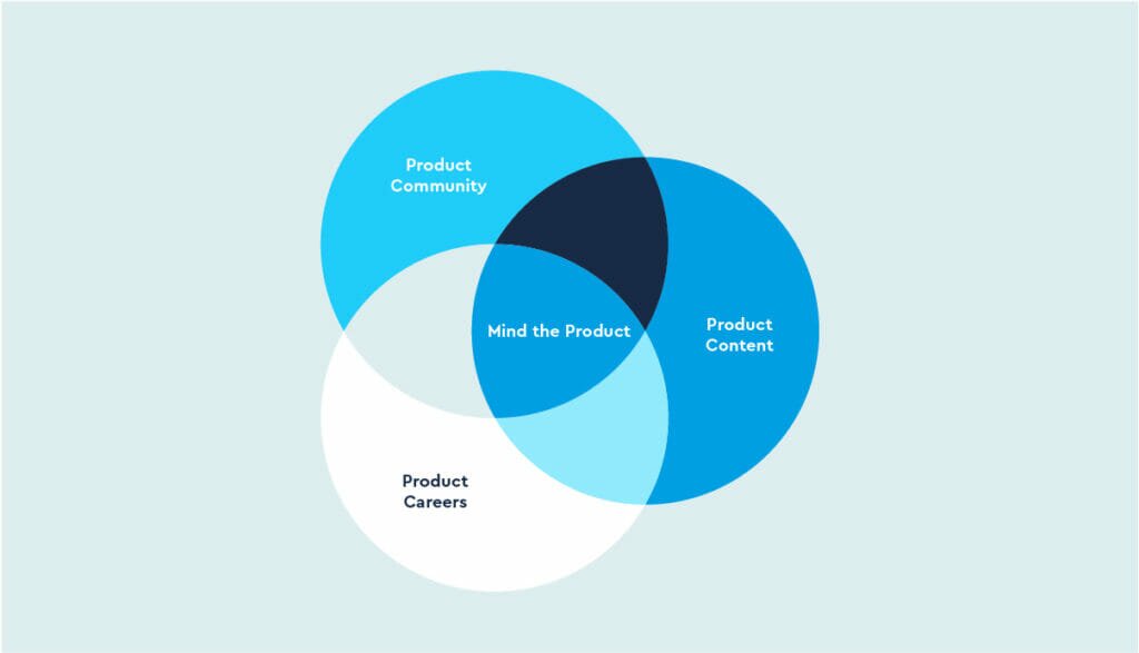
Everything we offer can be plotted on this Venn, and so we chose to base our colour weightings on where each service sits on this venn.
Bringing it all together
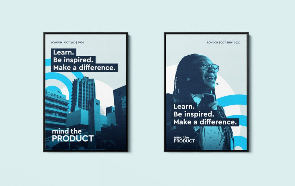
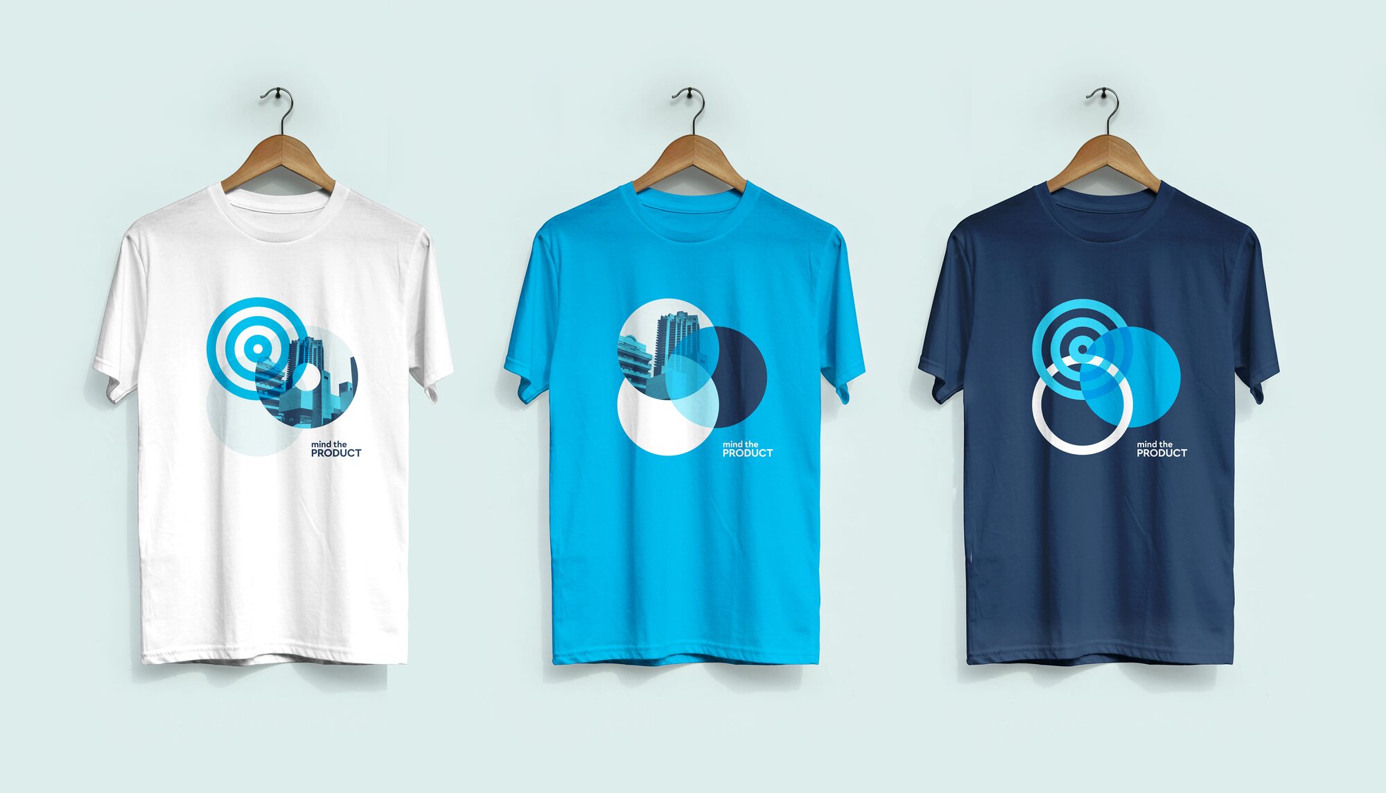
Once you bring together all those elements, we can do some really amazing things that still feel like Mind the Product but allow us to create much more dynamic and creative visuals that reflect our vibrant, global community.
Want to see more? Check out our full design system and brand guidelines.
Here’s to the next decade
Our new brand was a real team effort including Megan Sayers, co-founder of Make Good Design, Annabel Clements of Windmill Creative, and our internal team with lots of input from across our community and ProductTank network. Because like everything we do – this new brand identity will live on and evolve through our community — helping us continue to cement our place as the leading community for product people for the decades ahead.